Images and Captions in InDesign CS5.5
May 16 '12 0
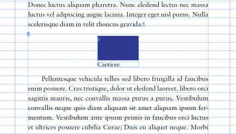
One problem we've come across repeatedly is how to get an inline image to sit between two paragraphs with an even space above and below it. You can always try doing this by eye, but we feel that it's best to use a technique that allows you to get it exactly right every time.
The main issue you have to contend with when trying to do this is a combination of the leading and the pinning of the anchored object.
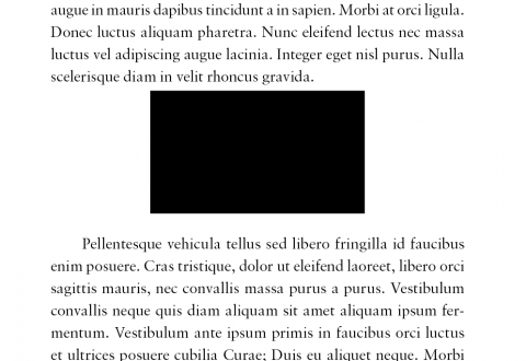
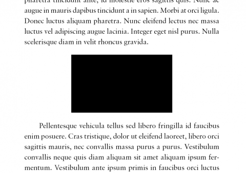
Taking a look at the default setting for the image with the text jump, you can see that it's not centred between the lines of text. We use the following method to deal with this:
- Anchor the image on a line of its own.
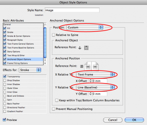
- Create an object style for the image, and under the ‘Anchored Object Options’ in the ‘Basic Attributes’ section, select ‘Custom’ positioning, with a top/centre reference point for the anchored object. For the anchored position, select centred, with the x-coordinate relative to the text frame and no offset; set the y-coordinate relative to the baseline.
- The distance from the top of the image to the text above will be whatever the leading is of the line containing the anchored object. You can increase/decrease the leading by however much you want by altering the leading of the whole line. (For example, if you set the leading close to 0pt, the object will sit right against the baseline of the text above.)
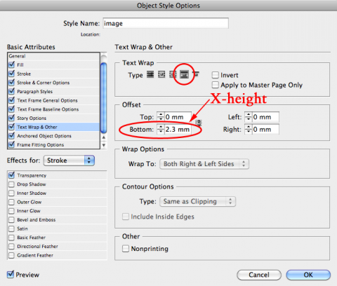
- In the ‘text wrap and other’ section, set the type of text wrap to ‘jump’.
- Now we need to be a little inventive. If we look at the original image again, the gap between the bottom of the image and the start of the text seems too small. This is because the space below is measured from the bottom of the image to the baseline of the text below, rather than the top of the line. This means that if we add the height of one capital X (which you may need to measure manually or guess - it's not the same as the leading), the gap below will match that above.
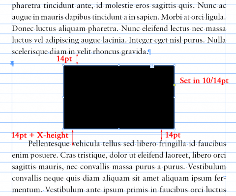
So when we do this…
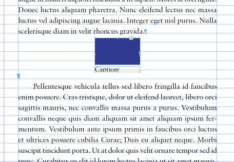
We now have an image that is spaced evenly between the two lines of text.
If you want this method to work with the baseline grid, you’ll need to make sure that the space above is a whole number of lines, plus half a line. The space below should be the same, plus the X-height.
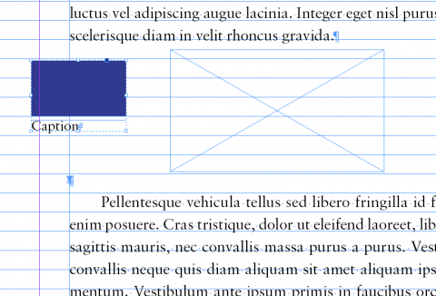
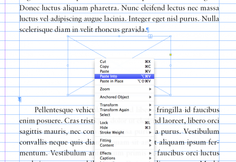
If you’re working with images with captions, the easiest way is to use the object style you’ve created for a box, inside which your grouped images and captions can sit. (All you need to do is paste the image and caption into the box and then shrink the surrounding box to fit its contents.)
